About a week ago we launched Khan Academy user profiles. Profiles are meant to round out the previous work we’d done on the design of the knowledge map, exercise interface, and badges by bringing all of the information about your performance on the site into a single interface.
There were a few competing design goals here, but the most important one was to flesh out what it means to “progress” within the Khan Academy. At a high level, the page breaks down into a few major sections
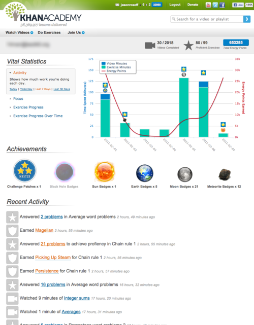
- A set of top level stats that emphasize completion of exercises and videos
- Vital Statistics: A completely new set of tools for measuring work: Activity, Focus, and exercise completion
- Achievements: A clearer summary and more interactive badge explorer
- Recent Activity: Pretty straight forward, but coalesces information that was previously hard to see
The original version of Khan Academy included stars (proficient exercises) and points (a measure of effort). When we added badges, and the badge summary page, it turned into the easiest way to measure progress because that information was so neatly summarized for users. It was never our intent to have badges be a primary motivator for the majority of users, but the lack of a profile was mildly distorting the experience for some users. While badges, stars, and points remain important, we wanted to make profiles a powerful metacognitive tool for students in the same way that the knowledge map helps them understand the interconnectedness of the topics in Math.
Don’t dumb it down
Kids are smarter than we give them credit for. No one likes being patronized at any age, but all too often software patronizes students. Things like overly kid-like color schemes, oversized buttons, and over-simplified user interface are only really appropriate for *very* young children because they send a clear message to everyone about what you think of their level of intelligence/expertise. After spending several hours observing and interviewing 5th graders, I am happy to report that they are more sophisticated and willing to experiment/explore than many adult users I’ve worked with.
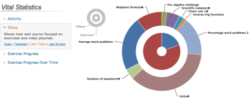
The Focus graph shows how a student has divided their time on the site over the selected time period.This is a complex graph in some ways, but it also engenders some visceral reactions, like, is it simple looking or busy? A student/teacher might not at first glance notice that on the exercise ring we show a star next to any module name that you’ve earned proficiency in, but when a user hovers the exercise the tooltip will explain what the star means. Our goal here was interesting at a glance but not necessarily completely obvious. The other important design decision on the graphs is that we didn’t use absolute scales anywhere. The result is that whether you spend 5 minutes or two hours on the site each day, the information remains visually interesting and useful.
Make it cool
We want students to start to identify themselves with the information that we’re showing in the profile. We want them to think it’s cool to have finished 80 math modules. As Ben has pointed out, grades are kind of boring in the grand scheme of things. Khan Academy profiles are designed to be visually compelling and highly interactive. Every chart provides tooltips and drill down capability (with back button functionality preserved). This gives a feeling of depth and allows students to explore/discover the connection between different metrics.
And what’s cooler than success, right? It’s one of the most addictive feelings in the world. So many students struggle with the feeling of failure, and constant absolute measures like grades only exacerbate the problem. Not everyone is going to move at the same pace, and so we owe it to students to find meaningful and interesting progress indicators that include both absolute and relative measures. Profiles were specifically designed to provide measures that help students better understand their own educational progress, set goals for themselves, and measure themselves against those goals. The good news is that it really seems to be working.
What do you think?
In Ben’s original post on what you guys wanted to see in user profiles there were a ton of good discussions and ideas generated. Are you using profiles? If so, are they interesting to you? Missing something important? Are there things you like/dislike about the design itself (especially if you’ve had trouble/confusion while trying to use profiles)?